6 Exit Intent Overlays to Influence Conversions
By Laura Taylor • Last updated: Thursday Apr 25th, 2024

Shoppers abandon sites for a whole host of reasons, from offline distractions to confusing navigation.
With visitors leaving at different points in the customer journey, you’re going to need a variety of incentives and messages to effectively re-engage each type of customer.
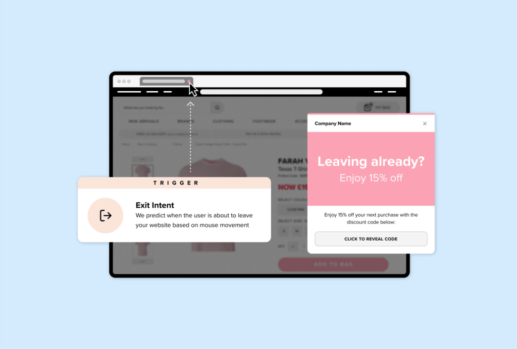
Tracking mouse gestures, resting moments and other cursor movements, exit intent technology intelligently detects when a user is about to abandon your site and triggers a Behavioural Overlay.
Exit intent Overlays provide a second chance to engage with your customers. By displaying content tailored to a shopper’s position in the sales funnel, you can encourage abandoning customers to remain on your site and persuade them to make a purchase.
Here, we take a look at six exit intent Overlays you can use to influence conversions.
Want to learn more about exit intent? Take a look at our beginner’s guide.
6 Exit Intent Overlays to Convert More Visitors
1. Provide a discount incentive
Discount Overlays are one of the most popular variations of Overlays for a reason – they work.
Savvy online shoppers often scour the internet for the best deal on a product, with unexpected or extra costs being one of the reasons why almost 70% of baskets are abandoned. By displaying a discount Overlay, you can reassure customers that they are getting a good deal and prevent them from being tempted to shop around with your competitors.
It’s also worth remembering that a higher discount percentage doesn’t necessarily mean a significant increase in conversions and it can in fact devalue your products. Sometimes just the incentive of a discount is enough to persuade shoppers to purchase. In this case it’s worth A/B testing different discounts to determine which percentage works best for your site.
2. Give shoppers a reason to stay
Discounts aren’t the only way to deter visitors from exiting your sales funnel. By showcasing the benefits of shopping on your site, you can prevent shoppers from abandoning their baskets without relying on discounting.
You can use this type of exit intent Overlay to highlight what your company is really all about. Perhaps you promote your USP, your free express delivery or your average review rate to leverage social proof. You can also reassure a customer’s concerns about returning a product by promoting your free and easy returns policy. Whatever you feel sets your business apart from its competitors, display it loud and proud to re-engage abandoning shoppers.
This Overlay strategy is particularly effective for new visitors who are unfamiliar with your brand. Prominently promoting the benefits of shopping on your site convinces new customers to remain in the sales funnel and explore your products with an enhanced intent to purchase.
3. Cross-sell and upsell to increase product exposure
Research by Monetate found that shoppers who engaged with a recommended product had a 70% higher conversion rate. You can replicate this by integrating personalised product suggestions into exit intent Overlays.
Displaying Product Recommendations in Overlays enables retailers to capture a shopper’s attention by showcasing products they might be interested in based on their on-site behaviour.
These Overlays can cross-sell products which complement an item a shopper has viewed, or they could offer upselling alternatives to a product they have in their basket. Cross-selling and upselling Overlays allow you to showcase your products and show customers what they are missing.
By basing product recommendations on a customer’s on-site behaviour, these Overlays can be individually tailored to target each shopper with products they can’t resist. As a last minute attempt to increase product exposure, cross-selling and upselling Overlays prevent customers from leaving your site and encourage them to continue browsing your product catalogue.
4. Promote your payment methods
Shoppers who attempt to exit your checkout page before purchasing are crucial prospects to target with genuinely relevant messages.
These customers have already searched your site, found the items they want and added them to their basket. They are engaged and intent on purchasing – so you’ll want to use a powerful method of persuasion to push them over that final hurdle.
One in three fashion shoppers opt to use Klarna when it is available at checkout, so promoting your Klarna integration when a user is about to exit your site can effectively persuade abandoning customers to remain on-site and complete their purchase.
Klarna’s ‘buy now, pay later’ solutions provide alternative payment options to remove barriers to purchase for customers. By reinforcing your Klarna integration at this crucial position in the customer journey, you can drive more conversions and maximise site revenue.
5. Grow your email subscriber list for future communications
If a visitor has browsed a few pages on your site, but hasn’t displayed any intent to make a purchase, instruct an email capture Overlay to trigger to encourage the shopper to subscribe to your newsletter to receive future updates and offers – you could even include a 5% discount code to sweeten the deal.
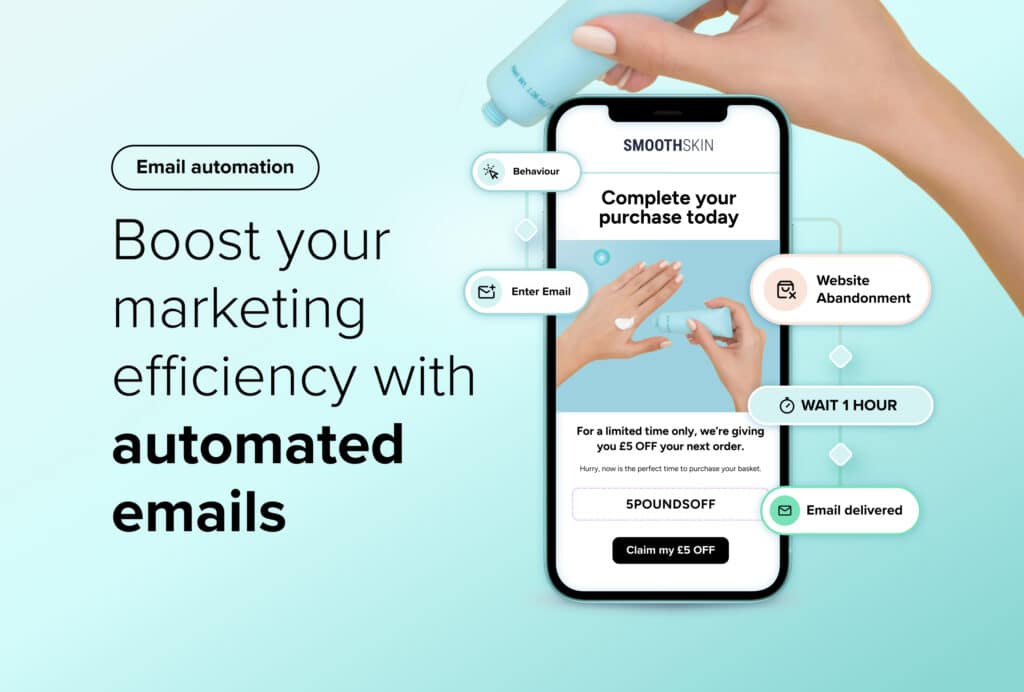
Even if they are a long way off committing to a purchase, by following up your Overlay campaign with personalised retargeting emails tailored to their on-site behaviour, you can retain these visitors in your sales funnel.
Although email capture Overlays are unlikely to immediately drive conversions, they do allow you to gain vital data from your customers and grow your email subscriber database for future off-site communications.
In your subsequent emails you then have the opportunity to establish a relationship with your subscribers and can work to convert first time visitors into loyal, returning customers.
6. Collect feedback to discover how to convert more visitors
Abandoning customers can tell you a lot about where your site is going wrong. You need to find out why these users are leaving your site so you can make improvements for future visitors.
A simple enquiry or feedback Overlay allows users to send you useful business suggestions which will highlight what causes shoppers to leave your site before making a purchase.
With this type of exit intent Overlay, it’s crucial to make the form as simple as possible for visitors to complete – they are already losing interest in your site so are highly unlikely to complete an extensive post-browsing questionnaire. Instead, use simple tick boxes, or questions that require only a short answer, to gather invaluable feedback which can inform future site amendments and conversion rate optimisation strategies.
When implementing exit intent Overlays, you must ensure your messages align with a customer’s position in the sales funnel.
Consider the page from which a customer is exiting and how this relates to their engagement with your company and their intent to purchase. If you think a number of exit intent Overlays could be appropriate in a particular context, try A/B testing a selection of them to determine which message resonates best with each type of customer.
See how Salesfire can help you optimise your product discovery experience, email one of our experts at enquiries@salesfire.com or book a free demo of our personalisation tools.


